


A bespoke printing house inspired by the zodiac sign Gemini. Like Gemini, Temple of Ink is rooted in curiosity, communication, and the ancient magic of sharing ideas.
This brand celebrates written expression as one of humanity’s oldest and most transformative acts of evolution.
Temple of Ink brings this mythology into the modern world, crafting zines, stationery, and printed works for cool, quirky businesses who want their message to carry both meaning and mystique.
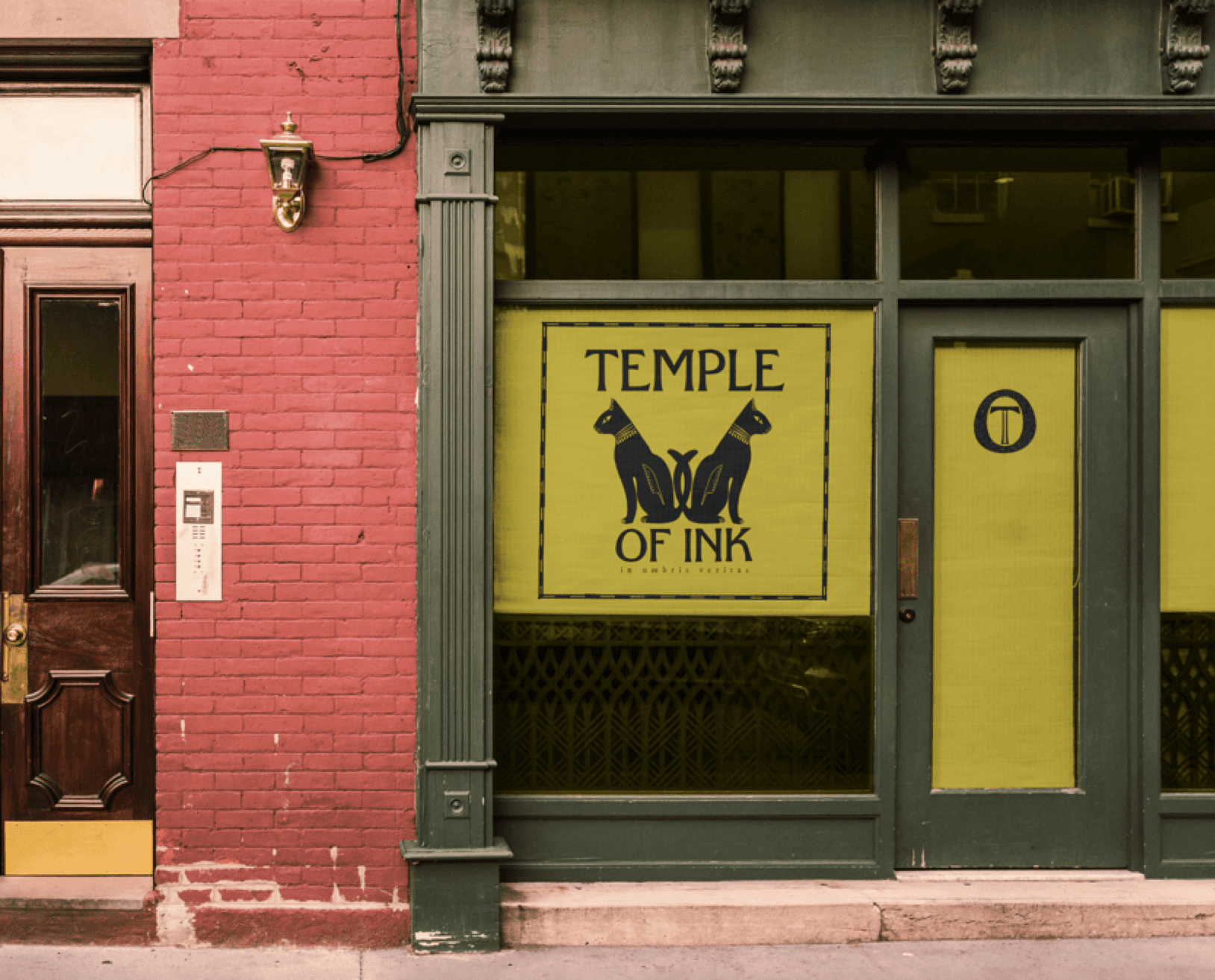
The design draws from ancient Egyptian art and hieroglyphs, honouring the first visual languages that turned shadows into stories.
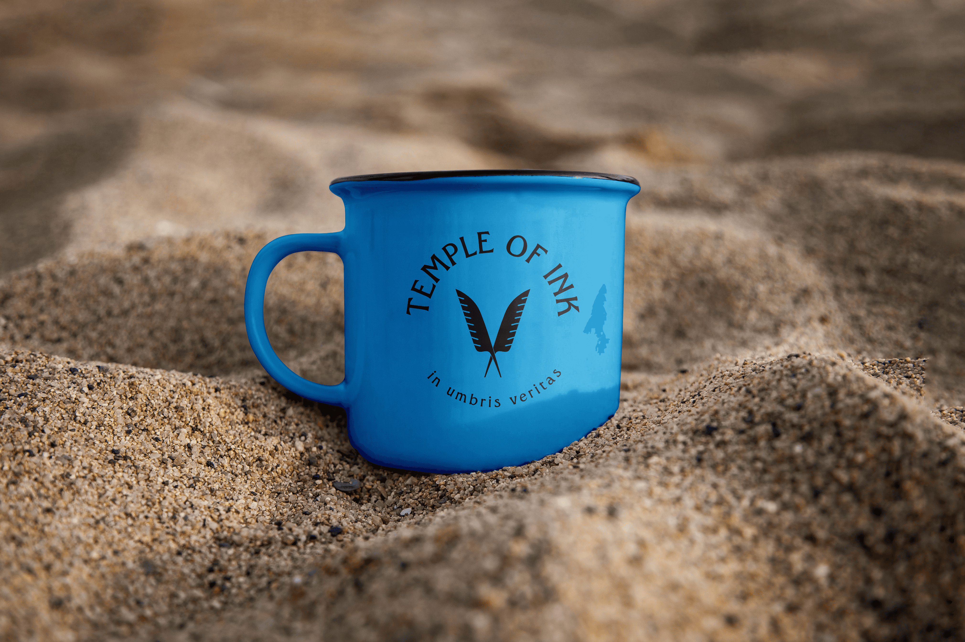
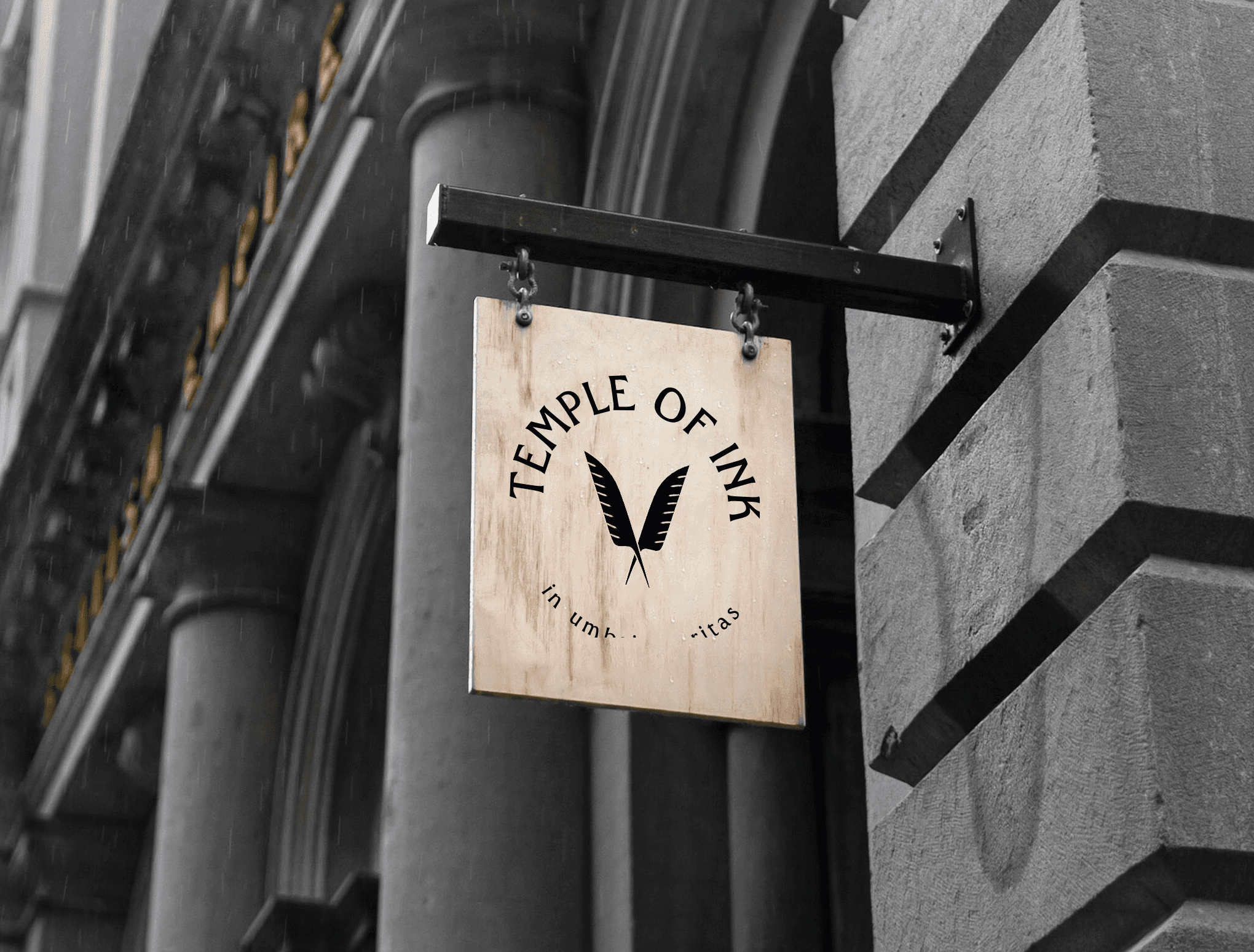
With a logo shaped by sacred symbols and a palette inspired by desert temples and ink-dark twilight, Temple of Ink embraces its guiding truth: in umbris veritas - from shadows, truth.
Vibe: clever, eclectic, mythic
Long before printing presses and pixelated screens, messages were carved into stone, brushed onto papyrus, and carried across deserts by those who understood the sacred power of the written word. Temple of Ink rises from that lineage - a modern sanctuary built on the ancient truth that communication is the first and oldest form of magic.
Inspired by Egyptian mythology, Temple of Ink honours the gods of knowledge and storytelling. It channels Thoth, keeper of wisdom and scribe of the universe, whose quill shaped the cosmos. It echoes Seshat, the goddess who recorded every earthly deed, her star-topped crown symbolising memory and meaning. Within these myths lies a single belief:
writing is how humans make the invisible visible.
Temple of Ink exists to continue that tradition - one zine, one print, one idea at a time.
Guided by Gemini’s dual nature, it celebrates curiosity, conversation, and the alchemy of turning fleeting thoughts into tangible artefacts. Every piece that leaves the press becomes a talisman of expression - something that begins as shadow (an idea, a spark, a whisper) and becomes truth once ink meets paper.
The brand’s visual identity draws from ancient Egyptian art, hieroglyphs, and symbols of sacred scribes. Lines are deliberate. Colours are vibrant and timeless. The tagline, In Umbris Veritas - “from shadows, truth” - reflects the journey of all great communication: from the unseen mind to the printed page.
Temple of Ink is more than a printing house.
It is a ritual.
A revival of craftsmanship and creative communion.
A place where cool, quirky businesses and creators transform their stories into printed relics that endure.
This is where ideas take form.
Where messages find their power.
Where truth emerges from the shadows - in ink.

©GHOST BIRD CREATIVE 2026
